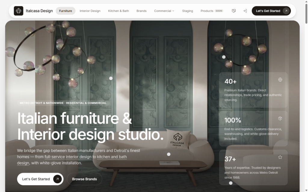

Good interface design is not a matter of taste. It is hierarchy, spacing, contrast and feedback — the boring foundational rules that decide whether someone finishes what they started on your site.
How we design
We design to a type scale and a spacing system, so the page has a rhythm instead of a pile of boxes. Primary actions look primary. Secondary ones get out of the way.
Every interactive element gets its states designed — hover, focus, active, disabled, loading, empty and error. Those states are where most websites quietly fall apart.
Responsive and accessible by default
Layouts are designed at phone, tablet and desktop rather than squashed down from one desktop mockup. Colour contrast and focus states are checked, not assumed.
What you get
Designs for every page and state, a documented type and spacing scale, and the component rules a developer needs to build it without guessing.